Branding guidelines
You have requested to use our Logo on your website, here are the guidelines.

Logotype
The Eurosender logotype is unique in its form and colors. Please keep in mind when using Instagram filtering and in editing procedures. The shown color variants are the only variations allowed, with the main logo guidelines still applicable.

Original logo
This is our main logo in its original colors.

Spacing
We respect the logo by giving it some space on all sides.

Black logo
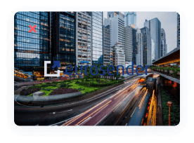
This logo can be used on white or other light backgrounds. Do not use this logo on dark or busy backgrounds.
White logo
It can be used on darker backgrounds, when the original logo is not visible. Do not use this logo on light backgrounds.
Minimum size
The logo should not be smaller than 100px in width.
Correct scaling of the logo + quality of the image (pixels): The logo can be resized to fit publications, PR material, flyers, etc. However, the original proportions must remain the same. The quality of the logo should always be preserved, not to display a very pixeled image.
Rotation
Our logo should typically be placed flat on a 0° angle. Our logo can be rotated when used on vertical formats and layouts, on digital media. The logo should not be rotated by more than 90°.
The don’ts
When using our logo, please follow our guidelines and make sure you do not:
- change the color of the logo
- change the logo’s proportions
- change the logo’ shape
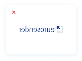
- flip the logo
- outline the logo
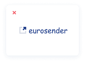
- recreate the logo
- place the logo over a busy background
- rotate the logo by more than 90°
- fill the logo with gradients
- do anything that doesn’t follow our guidelines
Symbol
The Eurosender symbol is the icon of the logo. It can be used in digital or print media, but never without additionally incorporating the full logo somewhere in the media as well. The symbol can be used in the same colour variants as the logo.


